01
RECENT
PROJECTS
Creative Excellence Recognized
-
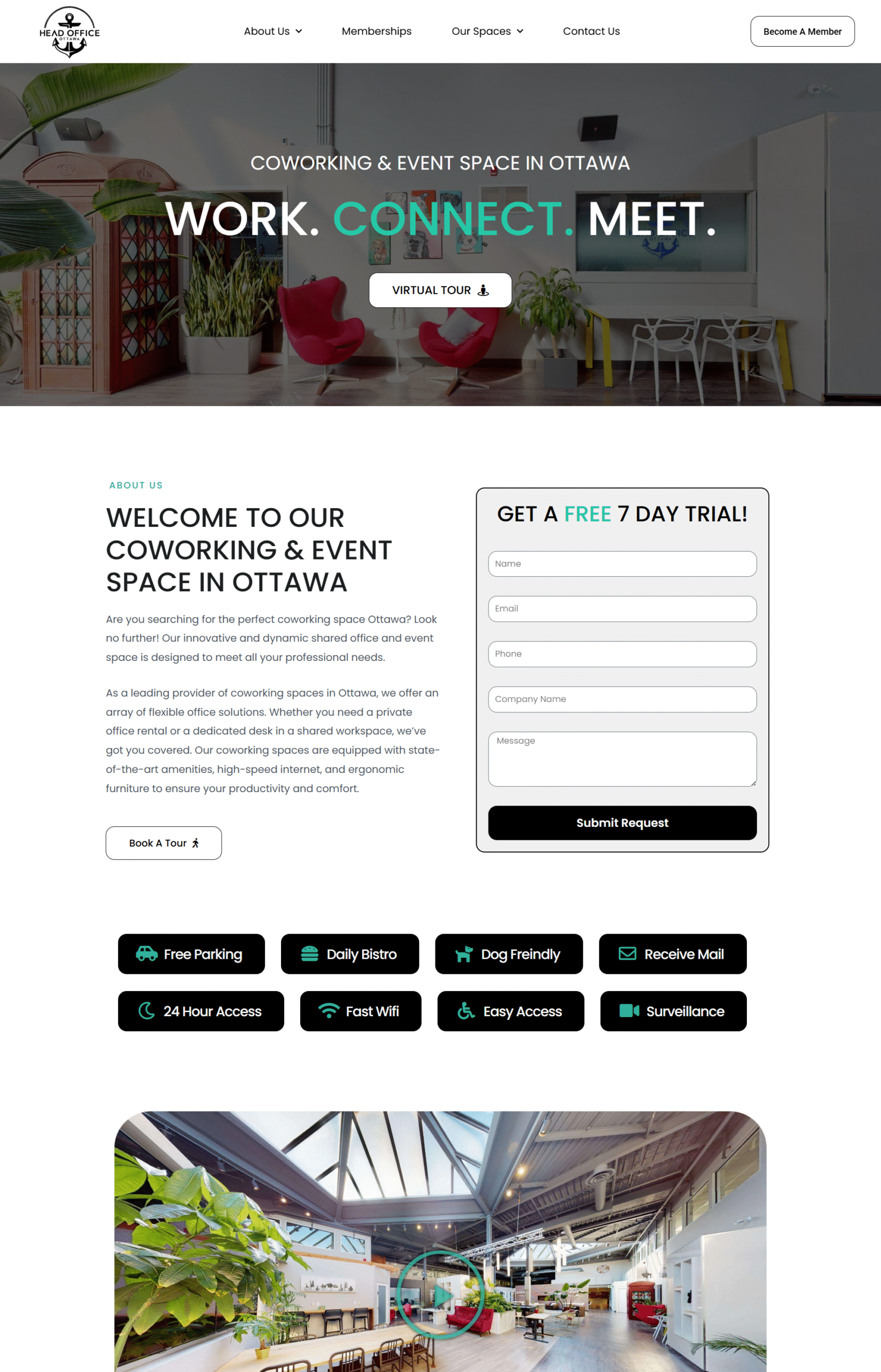
Photographic Story Telling
High-quality imagery is front and center, giving potential clients an immediate sense of the atmosphere—warm lighting, curated furniture, and an aesthetic that blends professionalism with boutique comfort. These visuals do the heavy lifting to sell the space, supported by minimal yet purposeful copy. -
Dual-Purpose Messaging
One of the key challenges was balancing two distinct offerings—coworking and event rentals—without confusing or diluting either. The website structure was carefully crafted to separate these pathways, using clear navigation and landing sections so users could instantly self-identify and explore the option relevant to them. -
Community-Orientated Copy
Throughout the site, the language emphasizes connection, inspiration, and flexibility—words that resonate with freelancers, creatives, and small business owners. This helps differentiate Head Office from larger, impersonal coworking chains by highlighting its boutique, human-first approach.
Key Project Elements
-
Elegant Visual Design
The website features a clean, minimalist aesthetic with a neutral colour palette, allowing LouLou Lounge's high-quality event rentals to take center stage. High-resolution imagery and subtle animations enhance the visual appeal without overwhelming the user. -
Comprehensive Collections Showcase:
The "Collections" section is meticulously organized, allowing users to browse through various categories of event rentals. Each item is accompanied by detailed descriptions and high-quality images, providing clients with a clear understanding of the offerings. -
Future-Proof Architecture
The site's backend is designed to accommodate future expansions, such as e-commerce capabilities or a client portal, ensuring scalability as LouLou Lounge grows.
Key Project Elements
-
Built For Paid Ads
Rather than sending Google Ads traffic to their main website (sunview-windows.com), which has multiple navigation paths and broader messaging, this landing page was created to tightly align with ad keywords and user intent. By eliminating distractions and emphasizing a single call-to-action, the page maximizes the return on ad spend (ROAS). -
Conversion Focused Design
There are no menus, blog links, or unrelated content. Just clean sections that guide the visitor toward the desired action. The page structure follows a proven hierarchy: headline → benefit → social proof → offer → CTA. This laser focus is what separates landing pages from standard websites. -
Mobile Optimization
With many Google Ads users coming from mobile devices, the page was designed to load quickly and display seamlessly across screen sizes. Key calls-to-action and forms are thumb-friendly, ensuring no opportunity is lost due to poor UX.
Key Project Elements
-
Built-In Lead Funnel
Calls-to-action are placed with intent throughout the site, inviting users to request a quote or consultation without being pushy. The "Get a Quote" button is always accessible, creating a simple funnel from interest to inquiry. -
Portfolio Preview Integration
Instead of showcasing dozens of project images in one place, the site introduces work samples subtly within relevant service sections. This approach keeps the page speed optimized while still giving users a sense of Trafford GC’s quality and attention to detail. -
Optimized For Local SEO
While visually appealing, the website was also structured with search visibility in mind. Targeted headings, location-based content, and alt-tagged images help ensure the site performs well for key local searches like “home renovation contractor in Ontario.
Do You
Have
A Project In Mind?
Let's Connect
Copyright © 2025, All rights reserved.


